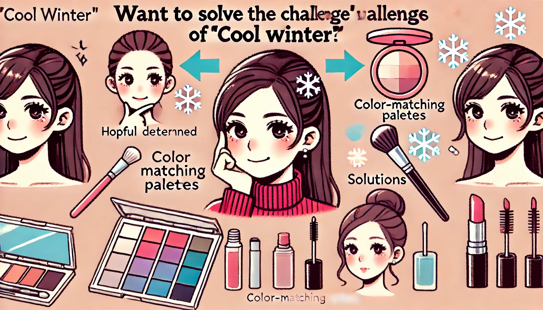
KARA

An infographic-style image explaining why the "Cool Winter" (ブルベ冬) personal color type feels more common despite being rare in Japan. The design should include visual elements such as social media influence, self-diagnosis errors, and perception bias. A Japanese woman looking at a phone, seeing posts about "ブルベ冬", with a puzzled or thoughtful expression should be included. The colors should be modern and clean, emphasizing blue and cool tones.

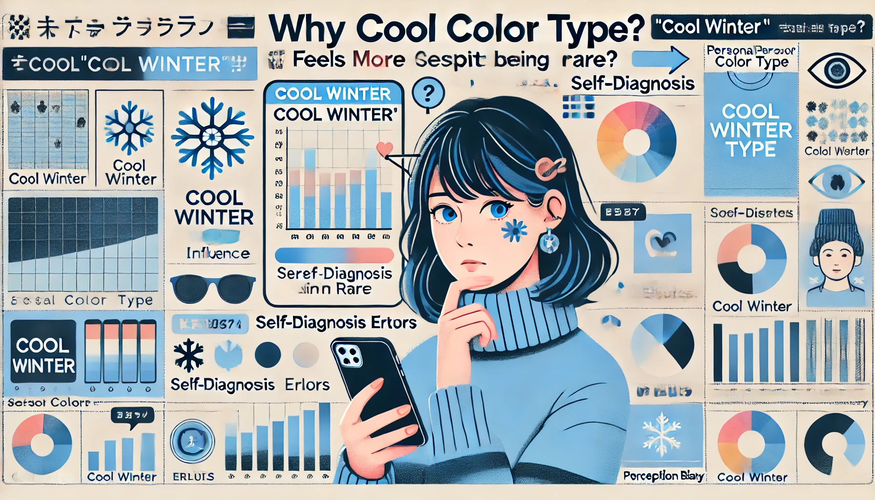
ブルべ冬が多すぎと感じる理由とは?実際の日本人の割合と診断の落とし穴

2025/2/25  

「ブルベ冬 多すぎ」と検索すると、多くの人が同じ疑問を持っていることがわかります。実際、日本人の中でブルベ冬は一番少ないパーソナルカラーとされています。しかし、SNSや自己診断の影響で「割合が多いので ...

A conceptual digital illustration depicting the question: Is Cool Winter (ブルベ冬) always fair-skinned? The image features a thought-provoking visual with a silhouette of a Japanese woman surrounded by cool-toned and fair skin color palettes, representing the curiosity and debate.

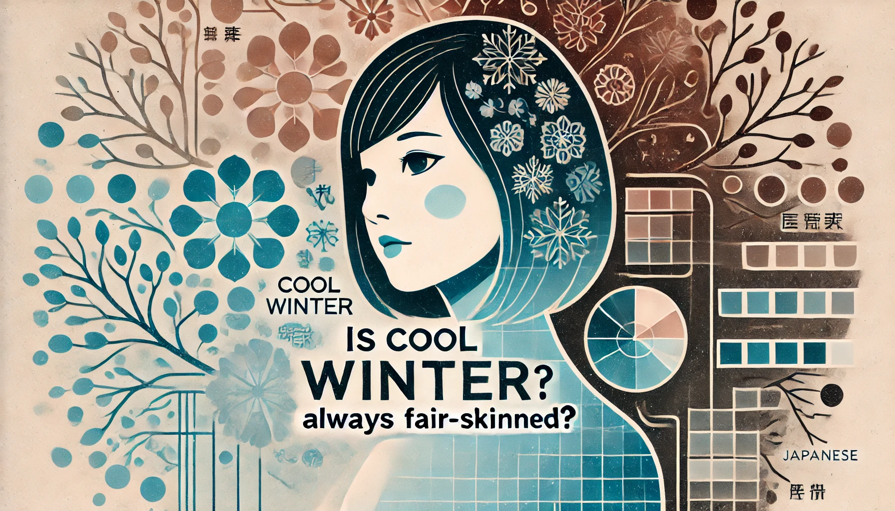
ブルベ冬で色白ではない人必見!肌色に関係なく似合う色と似合わない色の正しい選び方

2025/2/25    

「ブルベ冬=色白」というイメージを持っていませんか?実際には、肌色が色黒や黄み肌でもブルベ冬に分類されることがあります。 パーソナルカラーは、見た目の特徴や肌の明るさではなく、肌・髪・瞳のトーンに調和 ...

A digital illustration depicting a discussion about whether 'Cool Winter' (ブルベ冬) is considered a 'winner' in personal color analysis. The scene includes a stylish Japanese woman, a fashion expert, and a beauty influencer sitting at a table, engaged in a lively debate with speech bubbles showing different perspectives. The background features a chic and modern discussion panel setting. The atmosphere is engaging and thought-provoking, designed in a clean and professional graphic style.

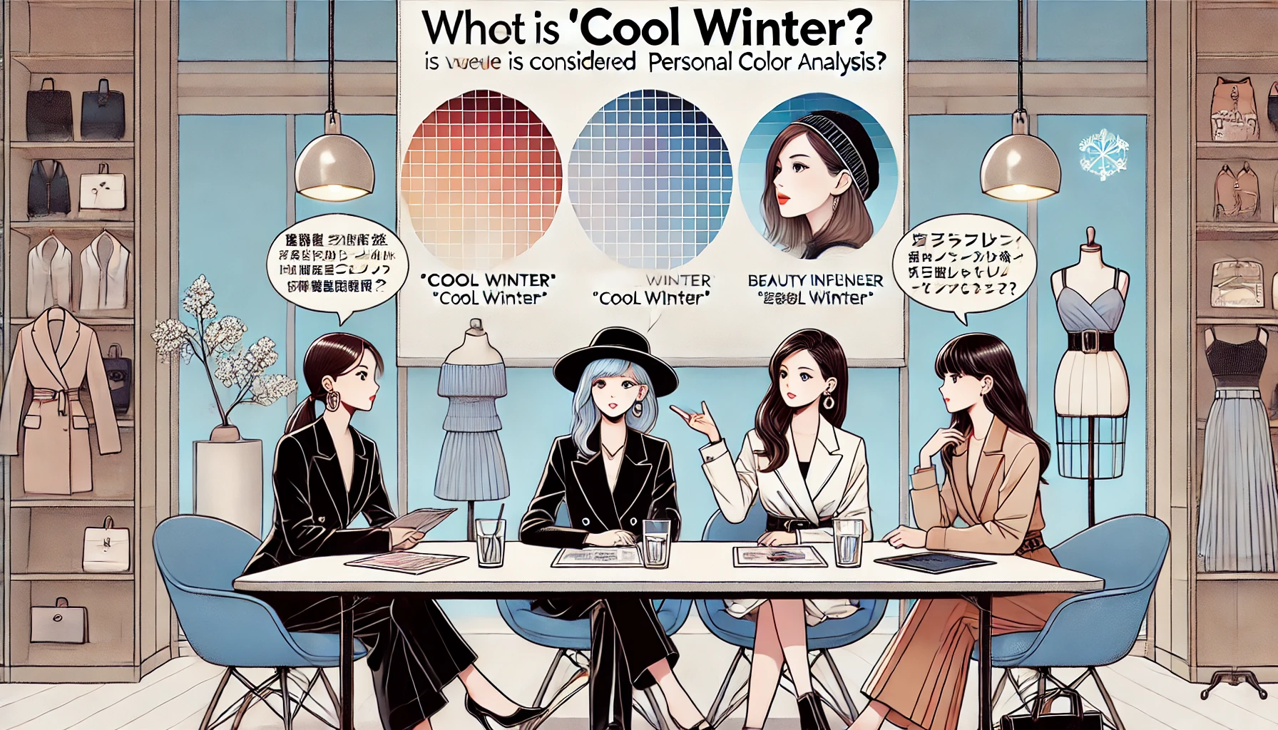
ブルべ冬は勝ち組は本当?顔の特長と美人が多いのか、似合う髪色やコスメまでを解説

2025/2/25    

「ブルベ冬は勝ち組」と言われることが多いですが、本当に美人が多いのでしょうか?芸能人にも多いブルベ冬タイプは、顔の特長がはっきりしているため「美人しかいない」「怖い印象」と思われることもあります。 し ...

A Japanese woman happily holding a newly purchased liquid foundation in her hand, smiling with excitement. The background is a softly lit vanity area with beauty products neatly arranged. She is looking at a mirror, appearing satisfied with her choice.

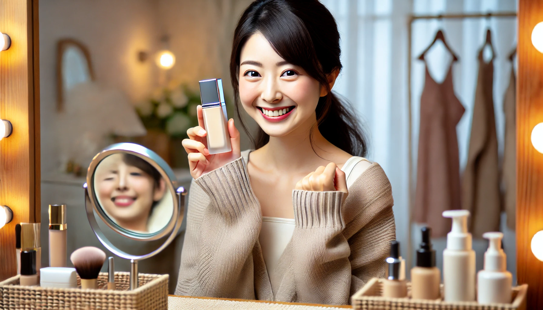
ケイトのリアルカバーリキッドの色選び!ライトグロウとセミマットの違いや肌質・年代別のおすすめ

イメージ ファンデーション選びで迷っている方にとって、「ケイトのリアルカバーリキッドの色選び」は重要なポイントです。カバー力と密着感に優れたこのファンデーションは、「ライトグロウ」と「セミマット」の2 ...

A Japanese woman joyfully holding a high-moisture and high-adhesion cushion foundation compact. She has a delighted expression, as if she has just found the perfect product. The background is softly blurred, emphasizing her happiness and the premium beauty product in her hands. The scene exudes satisfaction and excitement.

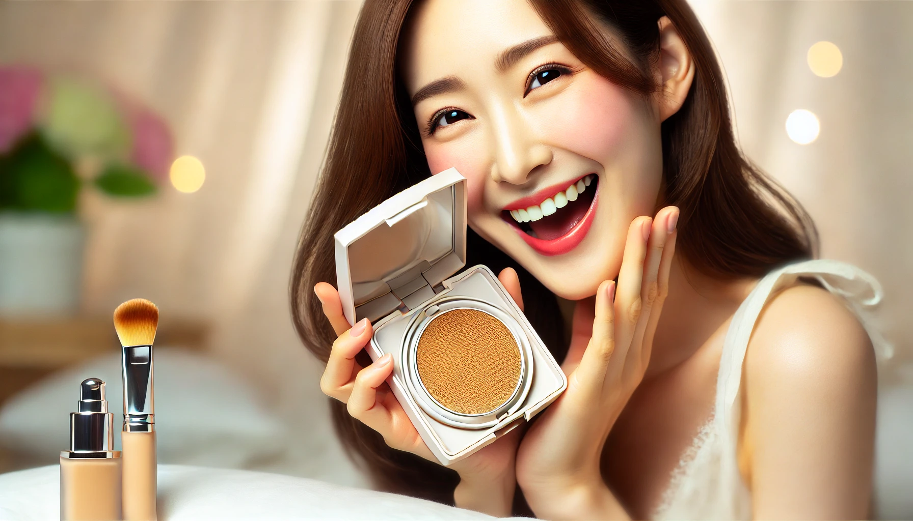
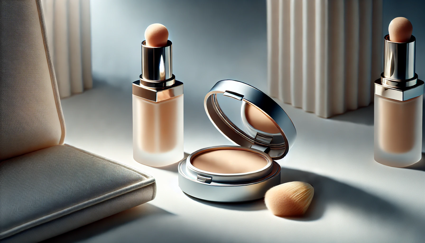
ラネージュのクッションファンデの色選び!21N・23N・17C1の比較やどこで買えるか解説

イメージ ラネージュのクッションファンデは、高保湿・高密着で自然な仕上がりが魅力の人気アイテムです。しかし、色選びを間違えると浮いてしまうこともあるため、自分に合うカラーを選ぶことが重要です。 本記事 ...

A cushion foundation with a lightweight feel yet strong coverage, blending naturally into the skin. The image illustrates the process of choosing the right shade, featuring a woman's hand swatching different foundation tones on her arm. The background is soft and beauty-themed, emphasizing natural skin tones.

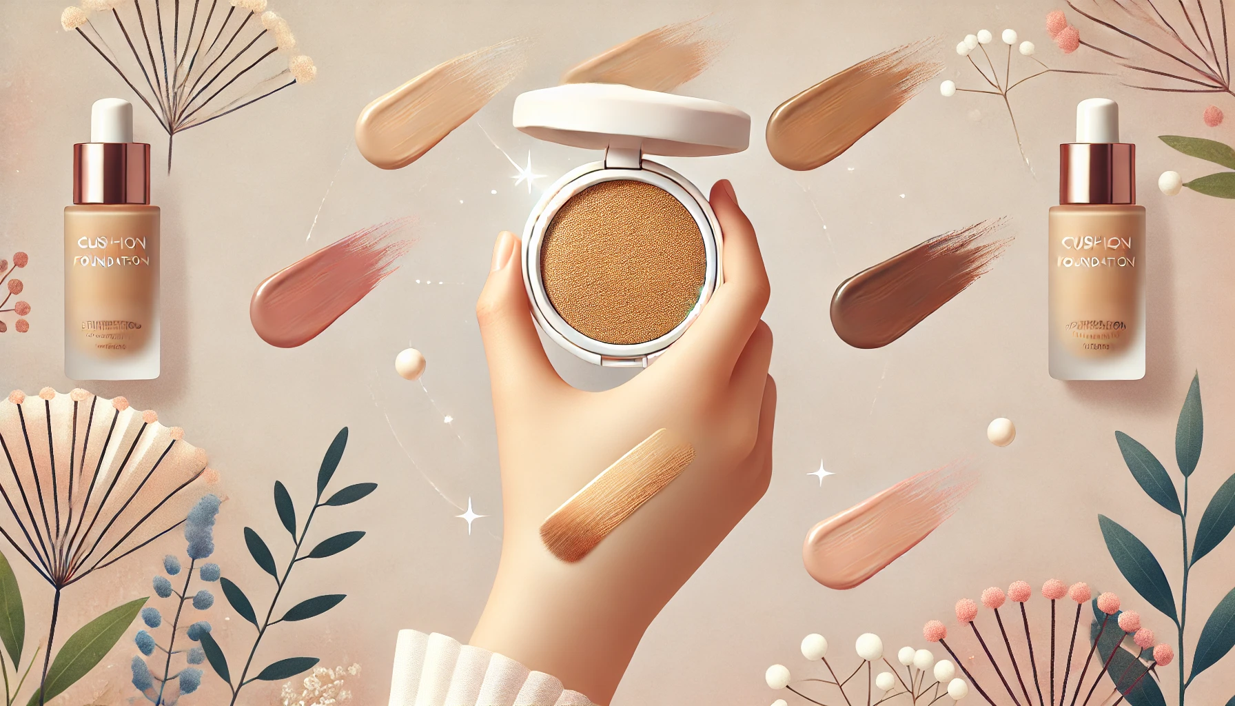
バニラコのクッションファンデの色選び!種類と口コミ、イエベ・ブルベ別おすすめカラー

イメージ バニラコのクッションファンデの色選びに悩んでいませんか?種類や色比較、人気色、口コミを知ることで、自分にぴったりのカラーが見つかります。 本記事では、17・19・21・22・23の色の違いや ...

A professional and informative infographic illustrating the risks and accuracy factors in personal color diagnosis photos. The design should highlight issues such as poor lighting, makeup interference, and incorrect background choices. The color scheme should be soft and visually appealing, with a clear layout. No text in the image.

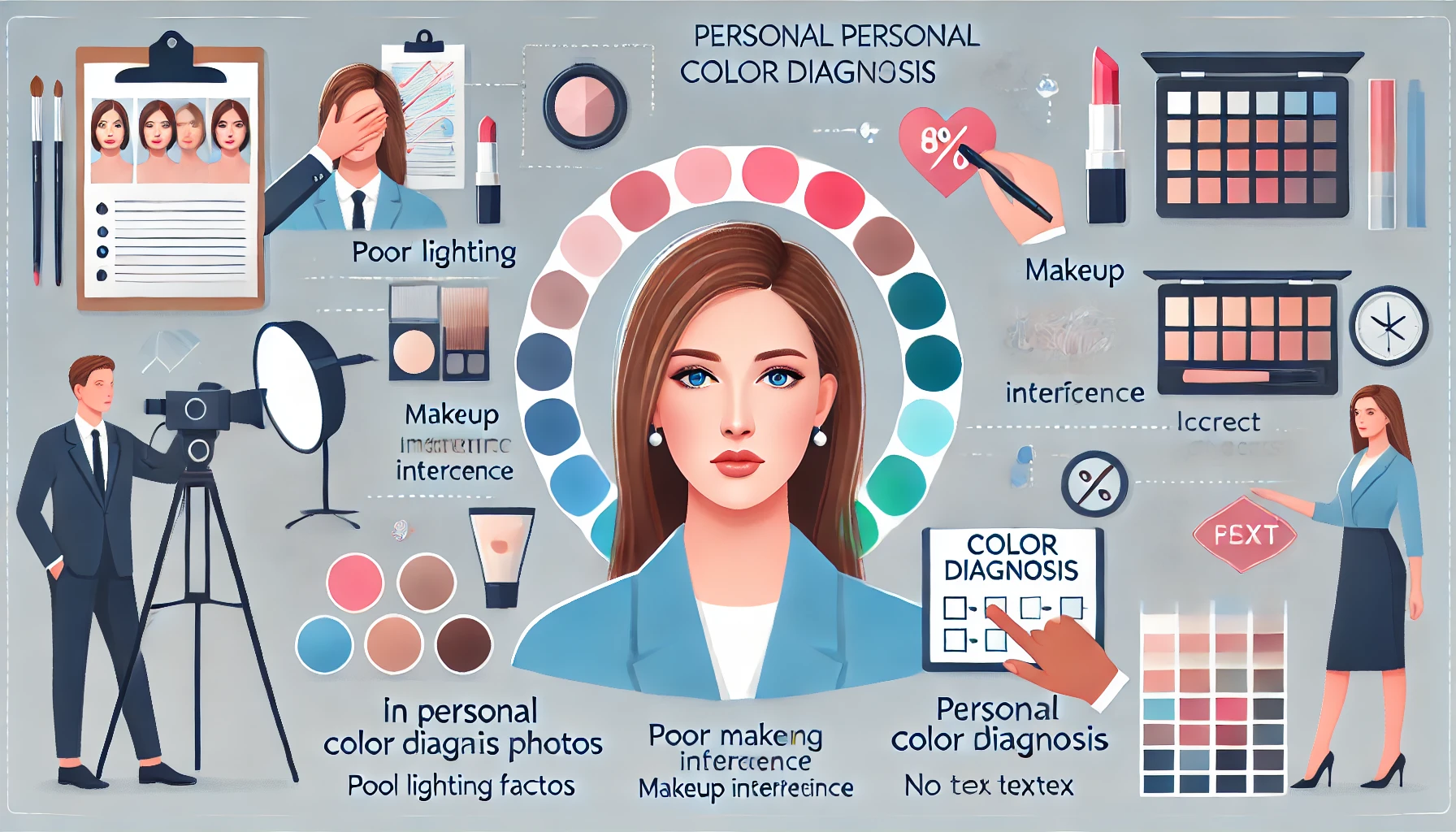
パーソナルカラー診断の当たる写真の撮り方と危険性を解説!正しく活用する方法

自分に似合う色を見つける「パーソナルカラー診断」は、ファッションやメイクに役立つと人気です。 しかし、オンライン診断を受ける際に「当たる写真」を撮影できていないと、正確な結果が得られないことがあります ...

A Japanese woman joyfully holding a luxurious black tube-packaged makeup primer. She is excited to have obtained the high-end product, showcasing its sleek and sophisticated packaging. The background is softly lit, emphasizing the exclusivity and elegance of the skincare brand. The atmosphere is warm and celebratory, highlighting her satisfaction with the purchase.

クレドポーボーテの下地はどれがいい?違い・口コミ・相性・人気のおすすめを紹介

2025/2/24    

イメージ クレ・ド・ポー ボーテの下地は種類が多く、「クレドポーボーテの下地はどれがいい?」と迷っている方も多いのではないでしょうか。 仕上がりの違いや似てる下地の比較、一番人気の下地とその人気の理由 ...

A luxurious balm foundation known for its dewy finish and hydrating formula, displayed beautifully in a sleek compact with a soft applicator. The background is elegant and minimalistic, emphasizing the product's premium feel. The lighting highlights the product’s glow and texture.

ヴィセのグロウバーム ファンデーションの色選び!口コミ・使い方や40代・50代に最適なカラー

イメージ ツヤ肌を叶えるヴィセのグロウバーム ファンデーションですが、色選びに悩んでいる方も多いのではないでしょうか。 00 ピンクベージュ・01 ライトベージュ・02 ベージュの3色展開があり、イエ ...

A Japanese woman happily holding a new gel eyeliner, smiling with excitement. She is in a well-lit room, possibly a beauty store or her home, showing joy after purchasing the product. The background includes subtle beauty elements like a mirror, vanity, or shopping bag to indicate the excitement of acquiring a high-quality eyeliner.

キャンメイクのクリーミータッチライナーの色選び!全色比較&人気色やイエベ・ブルベ別おすすめカラー

イメージ アイメイクを引き立てるアイライナー選びは、色や質感が重要です。キャンメイクのクリーミータッチライナーの色選びに迷っている方のために、全色のカラーバリエーションや色比較、人気色を詳しく解説しま ...